


How a Brand Campaign Built Its Visual Pitch with GPT Image 2.5
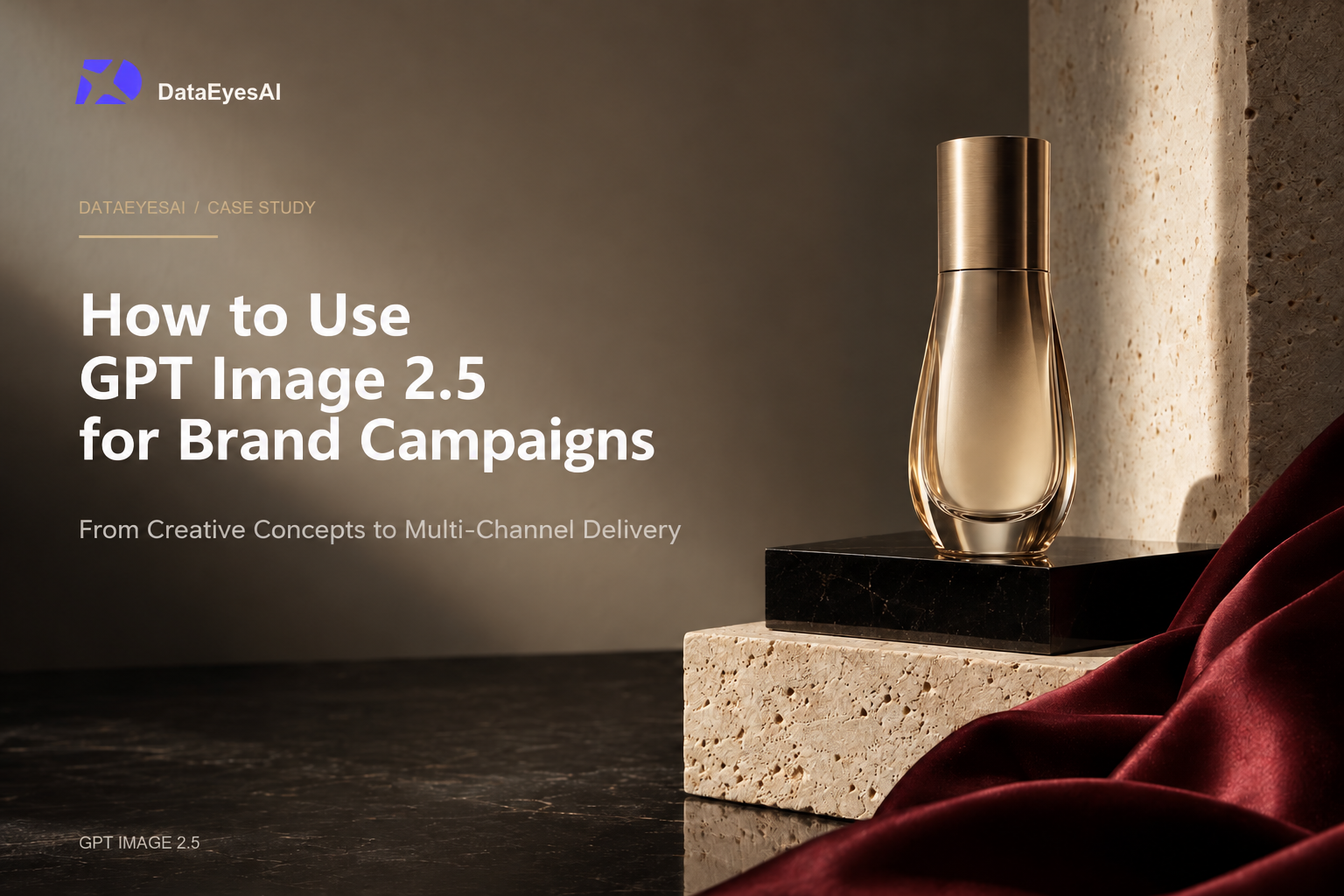
One of the most common challenges for brand teams is when the campaign is locked in and the copy is ready, but the key visual is still undecided. Designers need to explore multiple creative directions within a tight window, while the marketing team wants to see concrete visuals—like "try a different background," "make it feel more festive," or "keep the product intact, but go bolder."
Below is the complete workflow of how a skincare brand created its campaign visual proposal using DataEyesAI gpt-image-2.5-sunburst. Instead of expecting a finished poster from a single prompt, the team moved step by step—from reference images and initial concepts to targeted local edits and final delivery—turning vague ideas into actionable visual options.
Getting Started: The Team Needed More Than Just a Single Image
The theme of the campaign was "Summer Hydration." The team set three core requirements:
1. The product bottle must maintain its true proportions and exact color;
2. The visual must feel refreshing without falling into cliché blue water-splash templates;
3. The same visual system must adapt across website banners, social media posts, and print posters.
The designer started by preparing a product reference photo, the brand color palette, two texture references, and a checklist of non-negotiable elements. Pricing, product names, and campaign dates were intentionally left out of the AI generation stage and saved for final layout design.
Round 1: Testing Three Creative Directions First
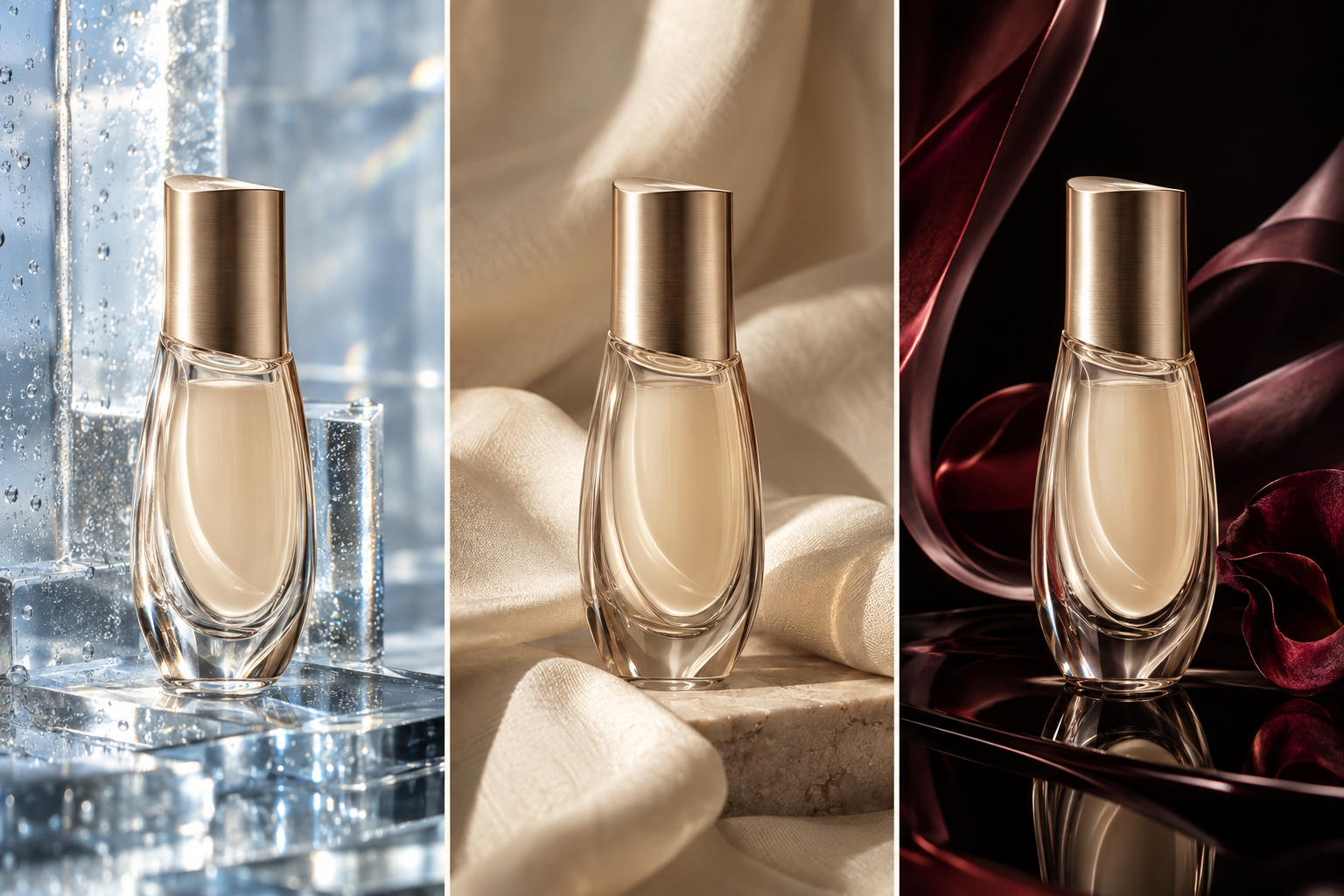
Instead of asking the model to "generate the final poster" right away, the team used GPT Image 2.5 Sunburst to explore three distinct visual directions:
Direction A: Frosted Glass & Fine Mist
The product is placed between translucent glass and delicate water mist, featuring a cool-toned palette that highlights purity and hydration.
Direction B: Soft Drapery
The product rests on light-colored soft fabric with natural folds casting gentle shadows, creating an approachable lifestyle mood ideal for social media.
Direction C: Abstract Liquid Light
Flowing purple and coral light forms wrap around the product, minimizing literal water elements for a look closer to a high-end brand ad.
The goal of Round 1 was not to pick a ready-to-publish image, but to give marketing, design, and brand leads concrete visuals to align on. Rather than giving vague feedback like "make it look more premium," the team could say specifically: "We love the color palette of Direction C, but we want the softer lighting from Direction A."
Round 2: Keeping the Core Subject, Refining Only Three Details
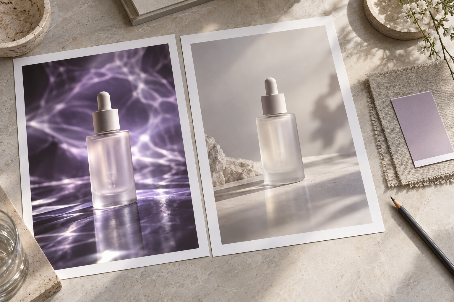
The team ultimately chose Direction C, but the first draft had three issues: the background was too distracting, the highlight on the bottle was overly harsh, and there was not enough breathing room between the product and the background.
Instead of regenerating the entire image from scratch, the designer instructed the model to make targeted adjustments:
Preserve the product bottle, color, proportions, and overall composition from the reference image. Modify only the following three points:
1. Reduce the contrast of the liquid light in the background;
2. Soften the specular highlight on the front of the bottle;
3. Add clean, light-toned negative space on the left side of the product.
Do not add any text, logos, pricing, or extra products.
The value of this iterative approach is that the team can keep building on the same approved visual without losing what already works in each regeneration. On the DataEyesAI model page, gpt-image-2.5-sunburst is highlighted for its precision editing, faithful reference preservation, and multi-turn consistency—capabilities built for exactly this kind of workflow.
Round 3: Adapting Compositions for Three Channels
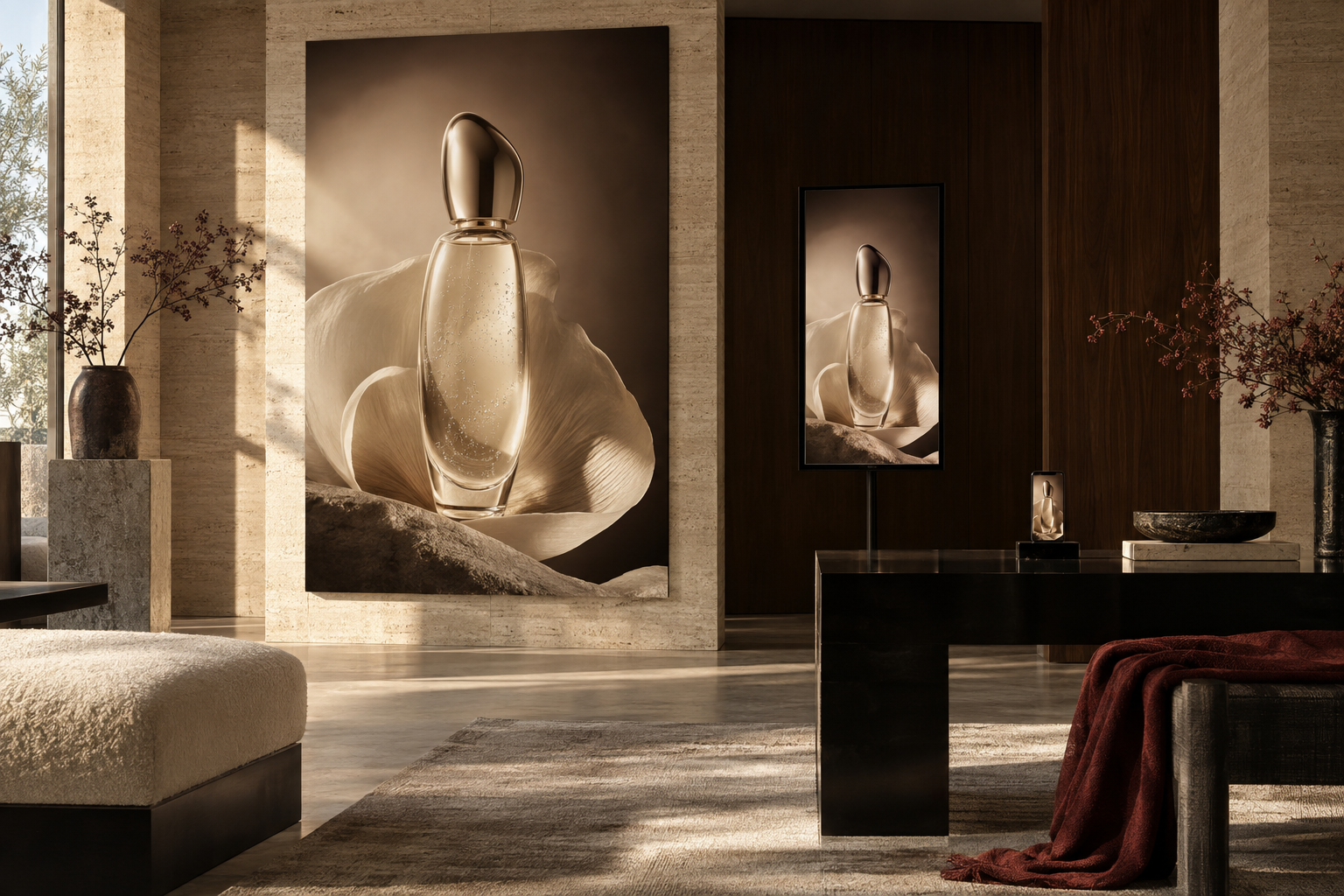
Once the key visual was approved, the team needed three channel-specific versions:
Website Banner
● Composition Adjustment: Position the product toward the right, reserving clean space on the left for headlines.
● Elements Preserved: Product proportions, color palette, and overall visual style.
Social Media Square Post
● Composition Adjustment: Center the product and reduce surrounding negative space.
● Elements Preserved: Key lighting and brand colors.
Offline Print Poster
● Composition Adjustment: Expand vertical space at the top and bottom for final typography and layout.
● Elements Preserved: The core product subject and its relationship with the background.
The model handled composition and visual extension, while exact campaign headlines, dates, QR codes, and pricing were added by the designer in the final production files. This ensured both rapid visual consistency across formats and 100% accuracy in campaign messaging.
What Time Did This Workflow Actually Save?
Previously, the team had to hold an initial creative briefing, wait days for designers to produce three to five rough comps, and only move into formal design after rounds of directional revisions. This new workflow combined "discussing the concept" and "seeing the concept" into the very same session:
● The marketing team could compare three distinct visual directions on day one;
● Designers focused their time on refining the chosen direction rather than drafting throwaway options;
● Brand leads could give specific, actionable feedback on a single shared image;
● One approved key visual was rapidly extended into multiple channel-ready formats.
What it truly cuts down is miscommunication and rework—not just image generation time.
How to Get Started in DataEyesAI
Head to the DataEyesAI Model Plaza, select gpt-image-2.5-sunburst, and upload your reference images to generate initial creative drafts. Once your direction is locked in, use multi-turn editing to fine-tune backgrounds, lighting, and local details.
DataEyesAI provides unified model access with flexible pay-as-you-go usage. Teams can complete text, image, and other multimodal tasks on a single platform, with actual costs based on the latest pricing and console details.
3 Common Mistakes to Avoid in Projects Like This
1. Asking for the final poster on the first prompt. Mixing creative exploration, layout, and exact text accuracy all at once drives up revision costs.
2. Regenerating the entire image for every minor tweak. Already approved product proportions, lighting, and style may shift unexpectedly.
3. Relying on the model to render mission-critical text. Logos, prices, dates, specifications, and campaign terms are best added later using professional design tools.
Conclusion
The real-world value of GPT Image 2.5 Sunburst lies in "visualized creative alignment" and "controllable multi-turn refinement." It empowers brand teams to visualize directions fast, iterate step by step around a single image, and hand off to designers for accurate final typography.
For product launches, seasonal campaigns, social media series, and ad pitches, this structured workflow is far more reliable than chasing a "one-click final poster."
You might also be interested

How to Make Viral AI Product Videos & Store Vlogs from 1 Photo (2026 Step-by-Step Guide)
Turn 1 product photo into viral e-commerce ads & POV store vlogs with DataEyesAI.

How to Summarize 100-Page PDFs & Research Papers with Claude 5.5, Gemini 4 & DeepSeek (DataEyesAI Guide)
5 copyable AI prompts to summarize 100-page PDFs & papers with DataEyesAI.

How to Turn a Selfie into a Travel Photo Using DataEyesAI's Image Agent (With Prompts & Real Results)
Turn a single selfie into natural travel photos with ready-to-use AI prompts.


